How to make a flyer: a step-by-step guide, words to print
How to make a flyer: what to write, which size to pick, how big the type should be, a check from across the room, and how to download it for print.

To make a flyer, start with the words: a headline, the details (what, when, where and how much) and the one thing you want people to do next. Then pick a size, usually 8.5 × 11 inches in the US or A4 elsewhere, and lay the words out with one big focal point and no more than two fonts. Add a photo or a QR code, check that it reads from a few steps away, and download a PDF for a print shop or a PNG to print at home or post.
In short:
- Decide what the flyer is for, who reads it and where.
- Write the headline, the details and the call to action.
- Pick a size, with bleed if a shop prints it.
- Start from a template, or describe the flyer to a design agent.
- Lay it out: one focal point, two fonts, strong contrast, room to breathe.
- Add a way to respond: a phone number, a short link, a QR code or tear-off tabs.
- Check it from across the room, proofread it, and download it.
The rest of this guide takes each step in turn, with the numbers that decide whether a flyer works: sizes in inches and pixels, how big the type should be, and how far away people read it. The how-to parts are shown in boom.design, but the advice holds in any tool.
1. Decide what the flyer is for
A flyer has one job. Before you open any tool, finish this sentence: "When someone reads this, I want them to ..." Come to the concert. Call for a quote. Sign up by Friday. If you have two jobs, such as a bake sale and a volunteer drive, you have two flyers.
Then think about where it will be read, because that decides most of what follows:
- In the hand, as a handout or a door hanger, it's read from about a foot away. Smaller type works, and a half-letter or postcard size is enough.
- On a wall, a bulletin board or a shop window, it's read from across a hallway or a room, often in passing. The headline has to work from far away, and the details have to be large enough to read without leaning in.
- On a phone, as a text, a post or a story, it's read on a small screen in a few seconds. It needs a tall shape and even fewer words.
2. Write the words before you design
Most flyers that don't work fail in the writing, not the design. Write every word first, in a plain note, then design around them. A flyer has three parts.
The headline. Five to eight words that say why the reader should care, not just the name of the event. "Bring a chair. We'll bring the brass." gets more attention than "Summer Concert Series". If the event's name has to be there, give it a line of its own under the headline.
The details. Everything a reader needs to act, and nothing they don't:
| Detail | Write it as | Example |
|---|---|---|
| What | One line, what it is and who it's for | A nine-piece brass band, free for all ages |
| When | The day of the week, the date and the times | Thursday, June 11, 7 to 9 pm |
| Where | A place people know, then the street address | Corliss Park Bandshell, 410 Lockhart Street |
| How much | The price, or "Free" | Free admission |
| Rain plan | Only if it matters | Rain moves us to the Corliss Rec Center |
Write the day of the week next to the date. People plan by "Thursday" more than by "June 11", and the two together catch a typo: if June 11 isn't a Thursday, one of them is wrong.
The call to action. One next step, said as an instruction: "Call (555) 015-3928", "Scan to sign up", "Book by April 30". Give a phone number, a short web address or a QR code, ideally two of them, since not everyone will scan.
Here is all of it on one flyer. The headline is the biggest thing on the page, the four details each have a box, and the phone number and link sit at the bottom where the eye ends up:

If you can, cut what's left. A flyer on a wall gets a few seconds of attention: whatever doesn't help someone show up, call or sign up can go on a web page the flyer points to.
3. Pick a flyer size
These are the sizes print shops in the US and Europe sell flyers in. The pixel sizes are at 300 pixels an inch, the resolution printers ask for, and include bleed: an extra eighth of an inch (in the US) or 3 mm (in metric sizes) of background on every side, which the shop trims off.
| Size | Inches or mm | Pixels at 300 DPI, with bleed | Good for |
|---|---|---|---|
| US letter | 8.5 × 11 in | 2625 × 3375 | Bulletin boards, shop windows, most events |
| Half letter | 5.5 × 8.5 in | 1725 × 2625 | Handouts, counters, mail inserts |
| Tabloid | 11 × 17 in | 3375 × 5175 | A small poster, a window seen from outside |
| A4 | 210 × 297 mm | 2551 × 3579 | The standard flyer outside North America |
| A5 | 148 × 210 mm | 1819 × 2551 | Handouts, leaflet drops |
| Phone (story-sized) | 9:16 | 1080 × 1920 | Texting, Instagram and Facebook stories |
When in doubt, use letter (or A4): it fits every bulletin board and every home printer, and any copy shop prints it. The bleed figures are a common default, not a rule. GotPrint, for example, asks for 0.125 in on every side, but check the spec sheet of the shop you use. For what bleed, trim and the safe area are, see the business card size guide, which explains them with a picture.
If you'll print the flyer at home, skip the bleed. Most home printers can't print to the edge of the paper, so set the page to the paper's size (2550 × 3300 pixels for letter) and keep the background white or leave a plain margin of about half an inch.
4. Start from a template, or describe the flyer
A blank page is the slowest way to start. In boom.design there are two faster ones.
From a template. Open the flyer templates, find one whose layout fits your words (not your subject: a concert flyer's layout works for a bake sale), and press Use this template. It opens in the editor as your own copy, at its print size with bleed.

From a sentence. In the chat, describe the flyer with the words you wrote in step 2, for example "A letter-size flyer for our park's free summer concerts, Thursdays in June, 7 to 9 pm at the Corliss Park Bandshell". The design agent first asks a few questions, one at a time: the size, one side or two, whether it'll be printed at a shop or at home (which decides the bleed), and anything it can't guess, such as the link for a QR code. Then it draws the flyer on the canvas, where you can change anything by hand or by asking. What an AI design agent does shows that from start to finish.
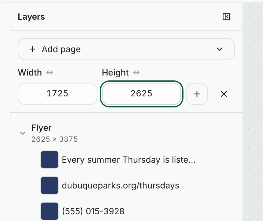
From a blank page. Every page shows its size in the bar above it when you click it with nothing else selected: type the Width and Height in pixels from the table above. To add a page of a new size, open the Layers tool, press Add page, choose Custom size…, type the width and height, and press the plus button beside them.
5. Lay it out: one focal point, two fonts, contrast
One focal point. One thing on the page should be clearly bigger or bolder than everything else, usually the headline or a photo. The eye lands there first, then moves down through the details to the call to action. If three things compete for first place, none of them wins.
Two fonts. A bold one for the headline and a plain, easy-to-read one for everything else. Most flyer guides agree on this, and Vistaprint's puts it plainly: more than three fonts looks chaotic in print. Script and decorative fonts are fine for a word or two in the headline and hard to read anywhere else.
Type big enough for where it hangs. How big depends on the distance (step 1):
| Text | Handout, read in the hand | Flyer on a wall |
|---|---|---|
| Headline | 36 pt and up | 72 pt and up |
| Details | 12 to 14 pt | 24 pt and up |
| Fine print | 9 pt at the smallest | 14 pt at the smallest |
The handout sizes follow Vistaprint's guide (24 to 36 pt headlines, 10 to 12 pt body, nothing under 9 pt). The wall sizes follow the University of Arizona's accessible flyer guide, which asks for at least 24 pt body text and 36 pt titles on a letter flyer. The 72 pt headline is a rule of thumb for a flyer read from across a room, not a figure from either guide.
On a page set up at 300 pixels an inch, a point is about 4 pixels, so in pixel sizes: 12 pt is 50, 24 pt is 100, 36 pt is 150 and 72 pt is 300. The concert flyer in step 2 sets its headline at 270 pixels, about 65 pt.
Contrast. Dark text on a light background, or light on dark, never two mid-tones. The University of Arizona's guide asks for a contrast ratio of at least 4.5:1 for normal text and 3:1 for large text. Text over a photo is the usual trouble spot: put it over a plain part of the photo, or on a band of solid color.
Room to breathe. Leave a margin all around and space between the groups of information. Empty space is what makes the headline look big. On a flyer printed with bleed, keep every word at least a third of an inch (about 100 pixels) from the edge of the page.
6. Change the words, colors and pictures
In boom.design, everything on a template is editable, and the bar above the page changes with what you select.
Words. Double-click a text to type in it. Select it and the bar shows its Font, its Font size (the number beside "Aa", in the page's pixels), its color, its alignment and its Spacing. In the Font list, the fonts already in the design are marked "In use", which makes it easy to stay at two.

Colors. Every color picker starts with the colors already in the design, under In this design, so a new shape matches the rest. If the design uses a brand kit, its colors come first, under Brand, and its logo is one click away in the Brand tool.
Photos. The Images tool searches free photos from Pexels and Pixabay; click one to place it. Your own pictures go in through Uploads. A photo of a product or a person usually looks better cut out: select it and press Remove background in its bar, which costs 1 AI credit.

7. Add a way to respond: a QR code or tear-off tabs
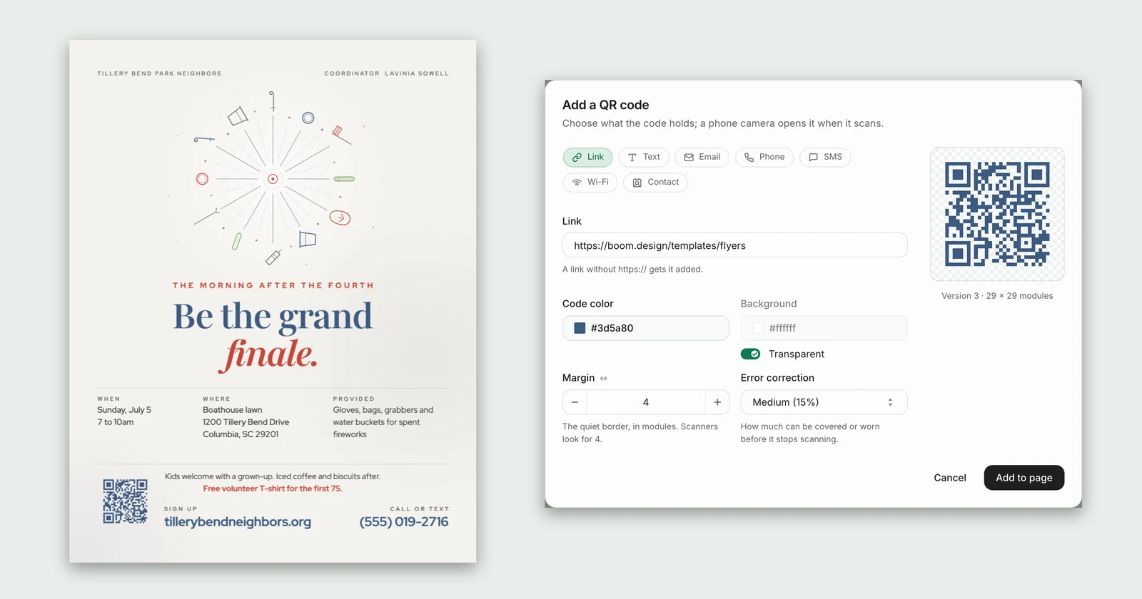
A QR code saves people typing a link. In boom.design, open Extras, press QR code, choose Link and paste the address. Print the short link next to the code as well, for anyone who'd rather type it, and add a few words that say what scanning does: "Scan to sign up". How to add a QR code to a flyer covers how big to make it and how to test it.
Tear-off tabs suit a flyer on a community board: a lesson, a lawn service, a room to rent. Each tab is a narrow strip along the bottom with the phone number or link, turned on its side, cut between tabs so people can take one. Repeat a word or two of what it's for on each tab ("20% off first mow"), since the tab ends up in a pocket without the flyer. boom.design has no special tool for them: start from a flyer that already has a row, like this one, or draw one tab, then select it and press ⌘D (Ctrl+D) to duplicate it along the row.

You can also ask the design agent to add a row of tear-off tabs with your number; it draws them as shapes and text you can edit.
8. Check it from across the room
A flyer on a wall is read from much further away than the screen you made it on. California State University, Long Beach's flyer accessibility guide takes 15 feet as a reasonable distance between a posted flyer and a passer-by, and notes that from there a letter page looks about the size of your thumbnail.
You can test that before you print. Zoom out until the flyer is about the size of your thumbnail on the screen. In boom.design, press ⌘− (Ctrl+−) a few times, or press the minus button in the zoom bar under the canvas. From that size you should still be able to read the headline and tell what the flyer is for. If you can't, the headline needs to be bigger, shorter or higher in contrast.

Then proofread, reading for these in turn rather than all at once:
- The date and the day of the week agree.
- The times say am or pm.
- The phone number is right: call it.
- The link and the QR code open the right page on a phone.
- Every name is spelled the way its owner spells it.
Finally, print one copy at actual size, pin it where it'll hang, and step back.
9. Download and print it
Press Download and pick a format:
- PDF for a print shop: one document, every page in order, with text and shapes kept sharp at any size. PDF comes with a paid plan. Its page is measured one point per pixel, so a letter flyer at 2625 × 3375 pixels opens far larger than 8.5 × 11 inches but in exactly the right shape: tell the shop to scale it to the trim size with bleed, or choose that option when you upload it.
- PNG at 1× to print at home or at a shop that takes pictures: a letter flyer is 2625 × 3375 pixels, which is 300 DPI at 8.75 × 11.25 inches, bleed included. PNG and JPG at 1× are on every plan, the free one included.
- PNG or JPG to post or text.

Printing at home. Print at 100% ("actual size"), not "fit to page", on the heaviest paper your printer takes. For a flyer with bleed, a home printer will leave a white margin round the edge anyway, so a design made at the paper's size without bleed looks neater.
Printing at a shop. Upload the PDF or the 1× PNG and tell the shop the trim size. For a handout, ordinary text-weight paper is fine. For a flyer that has to stand up on a counter or survive a week on a board, ask for card stock.
For phones. A letter flyer is too small to read in a text. Make a story-sized version, 1080 × 1920, as a second page of the same design: add it with Custom size…, or ask the design agent for "a 1080 × 1920 version of this flyer for Instagram stories". You can also share the design itself: Share gives a link anyone can open on their phone, one page at a time.
Where to put up flyers
- Community bulletin boards: libraries, community centers, laundromats, grocery stores, coffee shops, gyms and places of worship. Ask before you pin, and ask whether there's a size limit.
- Shop windows and counters along the street your audience walks, with the owner's permission. A half-letter flyer fits a counter better than a letter one.
- Door to door, as a door hanger or a handout. Don't use mailboxes: in the US only postage-paid mail may go in one.
- Online, the same day: the story-sized version in your stories and local groups, the letter one as a PNG in a post.
Note where every copy went, and take them down after the event. A flyer still up for a concert in June tells people the place isn't looked after.
Flyer questions
Can AI make me a flyer?
Yes, in two ways. An image generator draws a picture of a flyer, words included: it can look good, but the words are part of the picture, so fixing a wrong date means drawing it again. A design agent, like the one in boom.design, writes and lays out the flyer as real text, shapes and photos on a canvas, so you can change any word, color or picture afterward, by hand or by asking.
What is the best font for a flyer?
There's no single best one. Pick a bold, wide font for the headline and a plain sans serif for the details, such as Inter, Open Sans, Lato or Montserrat, and stop at two. Keep scripts and decorative fonts to a word or two.
Where can I find free flyer templates?
boom.design has 97 flyer templates, from concerts and charity runs to garage sales and lawn services. Each one opens in the editor for free, and you can download it as a PNG or JPG on the free plan.
What size is a flyer?
In the US, usually 8.5 × 11 inches (letter), or 5.5 × 8.5 inches for a handout. In most other countries, A4 (210 × 297 mm) or A5 (148 × 210 mm). See the size table above for the pixel sizes.
Flyer templates to start from
These are recent flyers, each at its print size. Pick one whose layout suits your words, change them, and download it. The community flyers are a good place to start for an event.

Minimalist Dollhouse Row House Open House Flyer

Photo-Led Venezuelan Arepa Food Truck Flyer

Inkblot Test Card Carpet Cleaning Service Flyer

Retro Western Shirt Embroidery Line Dancing Class Flyer

Soil Core Sample Box Lawn Aeration Flyer
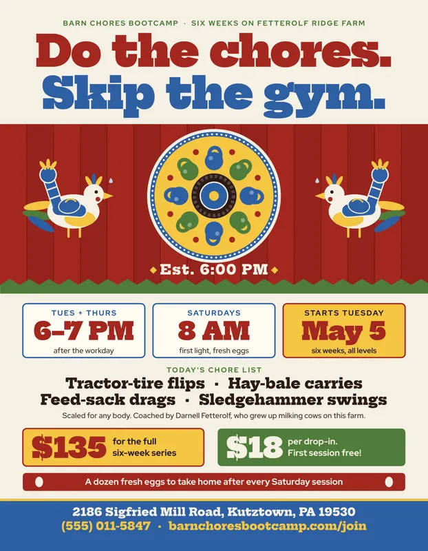
Folk Art Hex Sign Farm Fitness Bootcamp Flyer

Bold Skateboard Deck Art Exhibition Flyer
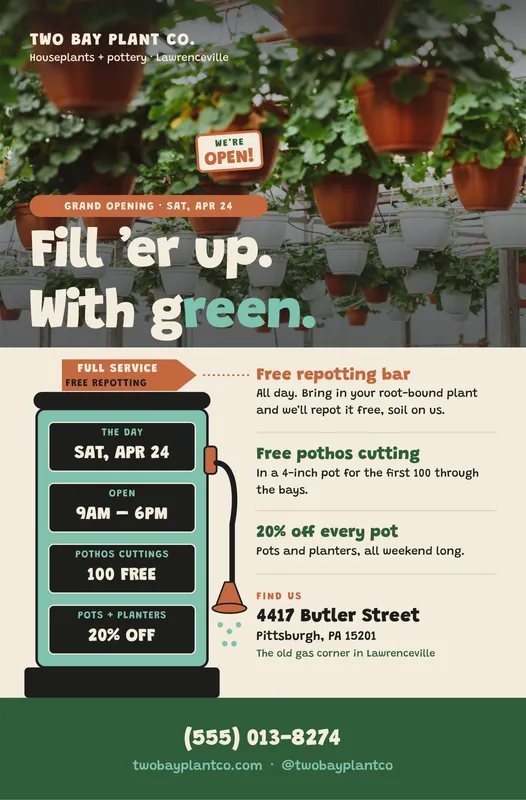
Photo-Led Gas Pump Houseplant Shop Grand Opening Flyer
Or describe your flyer and let the design agent draw the first version: