Menu design ideas: 15 layouts that are easy to order from
Menu design ideas for restaurants, cafés and bars: 15 layouts with real examples, where prices go, and a QR code that opens the menu on a phone.
Good menu design makes ordering easy. Pick a format that fits how many dishes you serve, group the dishes into short sections in the order people eat, give each dish a name, a few words and a price, and make one or two dishes stand out. Below are 15 menu design ideas that do that, sorted by what each one solves: the format, how dishes stand out, prices and wording, and the look.
Every example is a real menu from the boom.design menu templates. Open one, type in your own dishes and prices, and print it the same day. The steps are at the end, along with how to put a QR code on the table that opens the menu on a phone.
Pick the format first
How many dishes you serve decides the format more than the style does. A menu with too little room gets small type; one with too much room looks empty. The menu templates come in four shapes:
| Format | Size | Suits |
|---|---|---|
| One page | 8.5 × 11 in | About 15 to 25 dishes in two columns |
| Legal page | 8.5 × 14 in | A long menu that should still be one sheet |
| Two pages | 8.5 × 11 in each | Food on one side, the rest of the meal or drinks on the other |
| Tall card | 4 × 9 in | Short lists: cocktails, desserts, a tasting menu |
1. One page, two columns
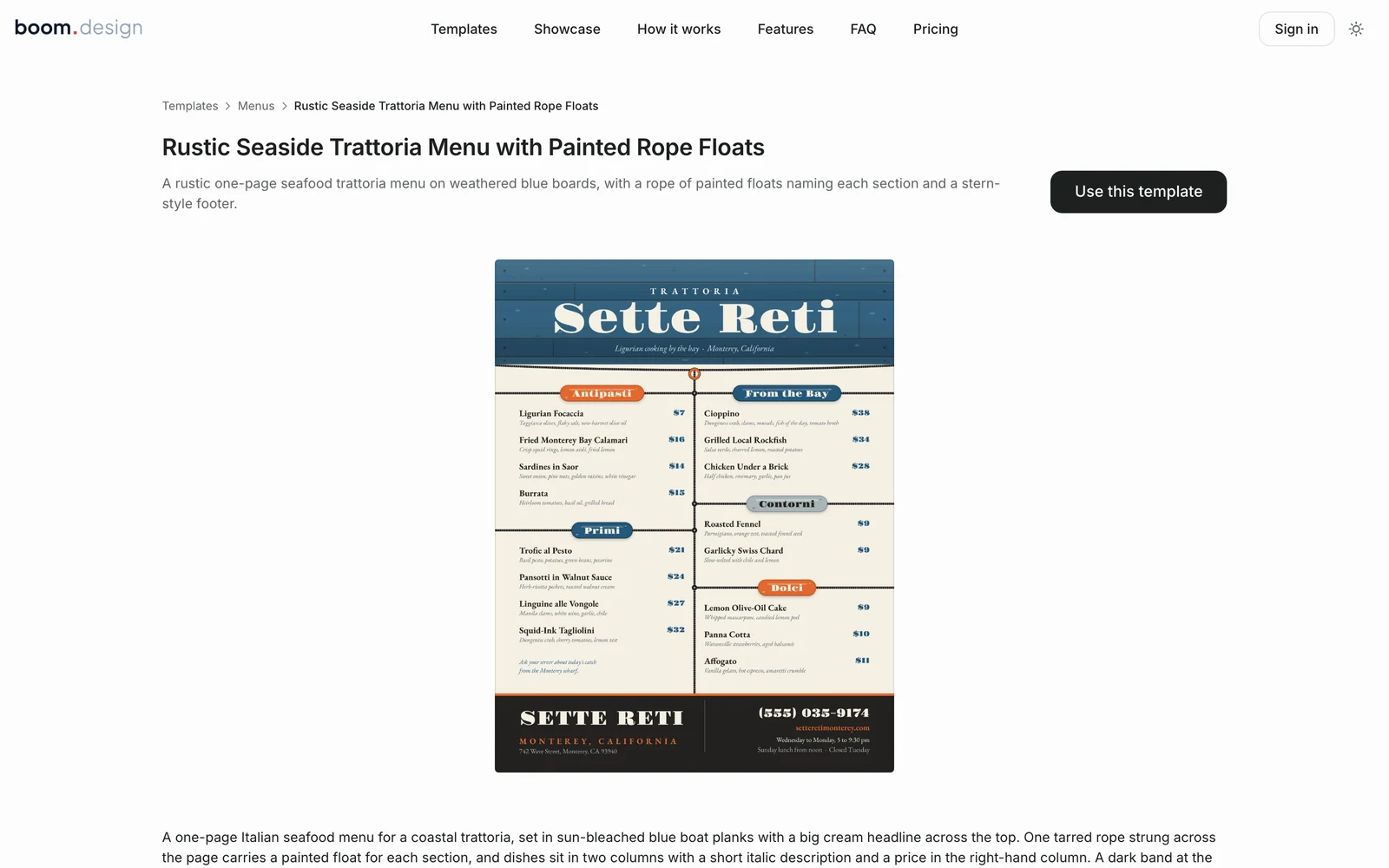
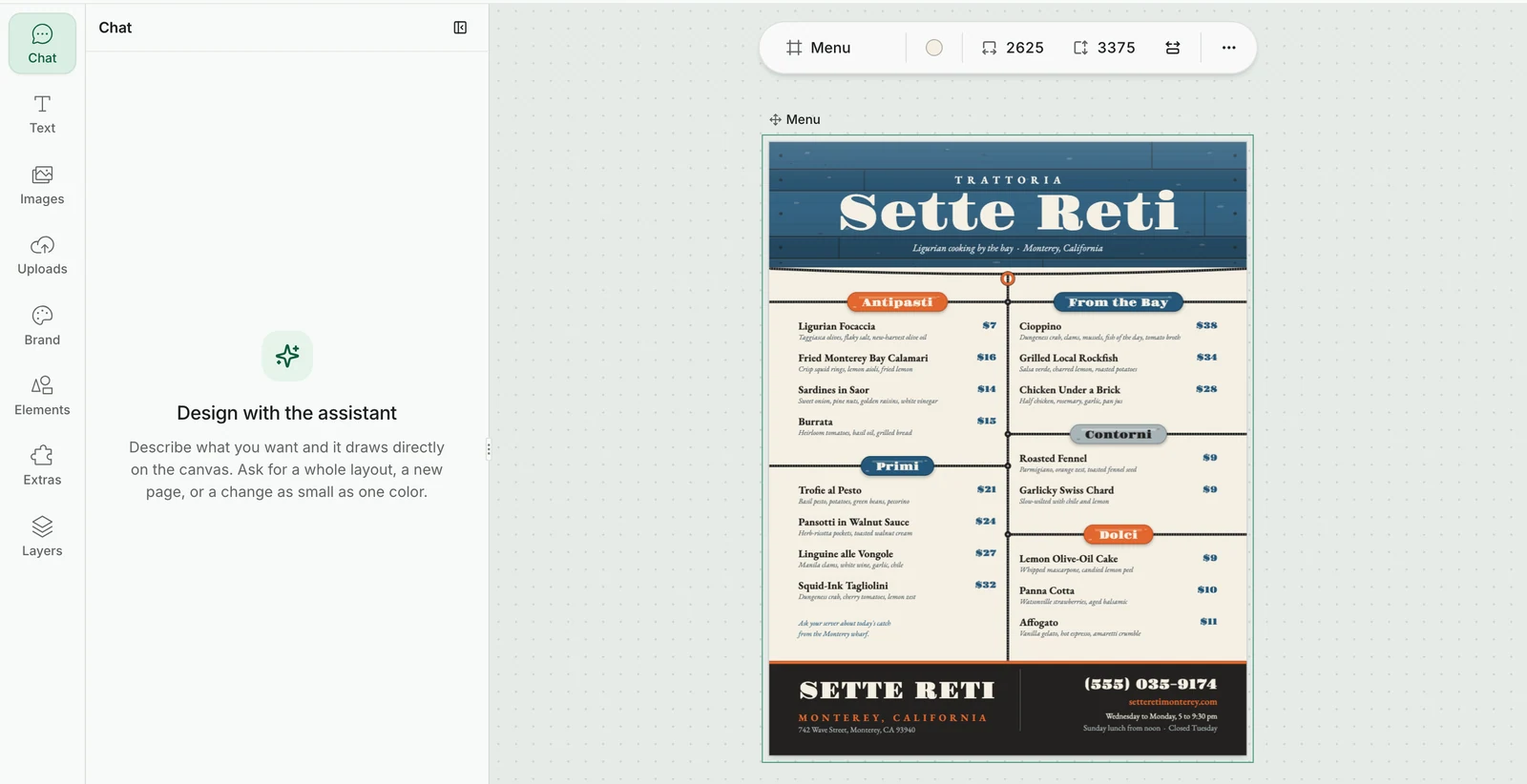
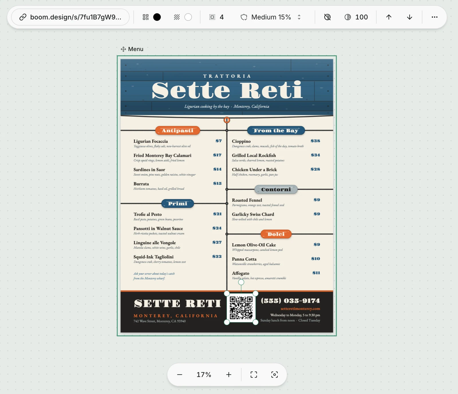
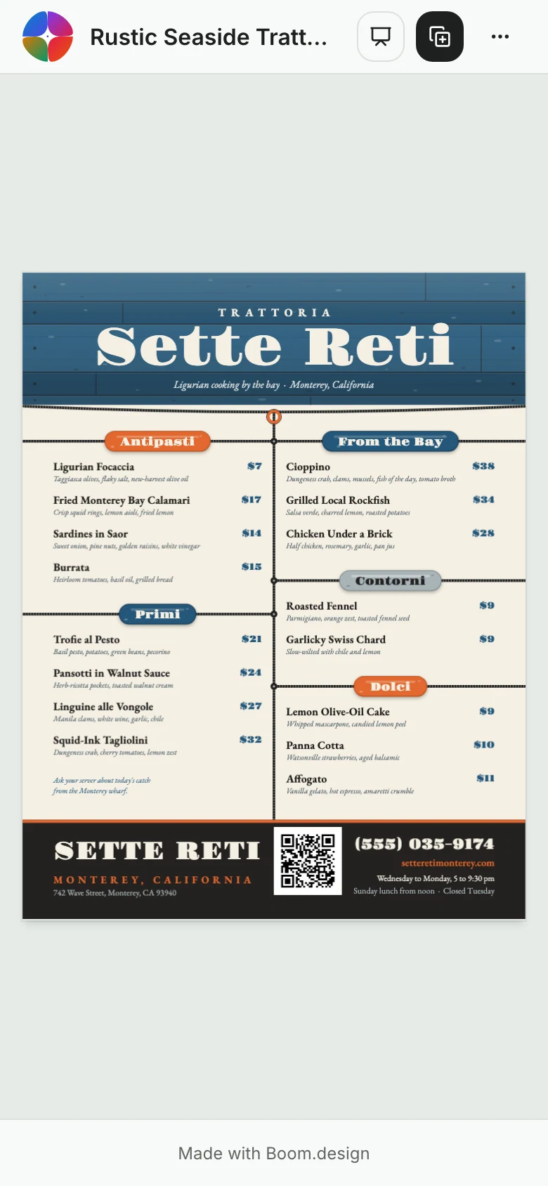
The simplest menu people read in one look. Sette Reti fits 16 dishes into five sections on a single letter page: starters and pasta in the left column, fish, sides and desserts in the right. A dark band at the foot holds what people look for last: the phone number, the hours and the website.

2. Two pages that read like a book
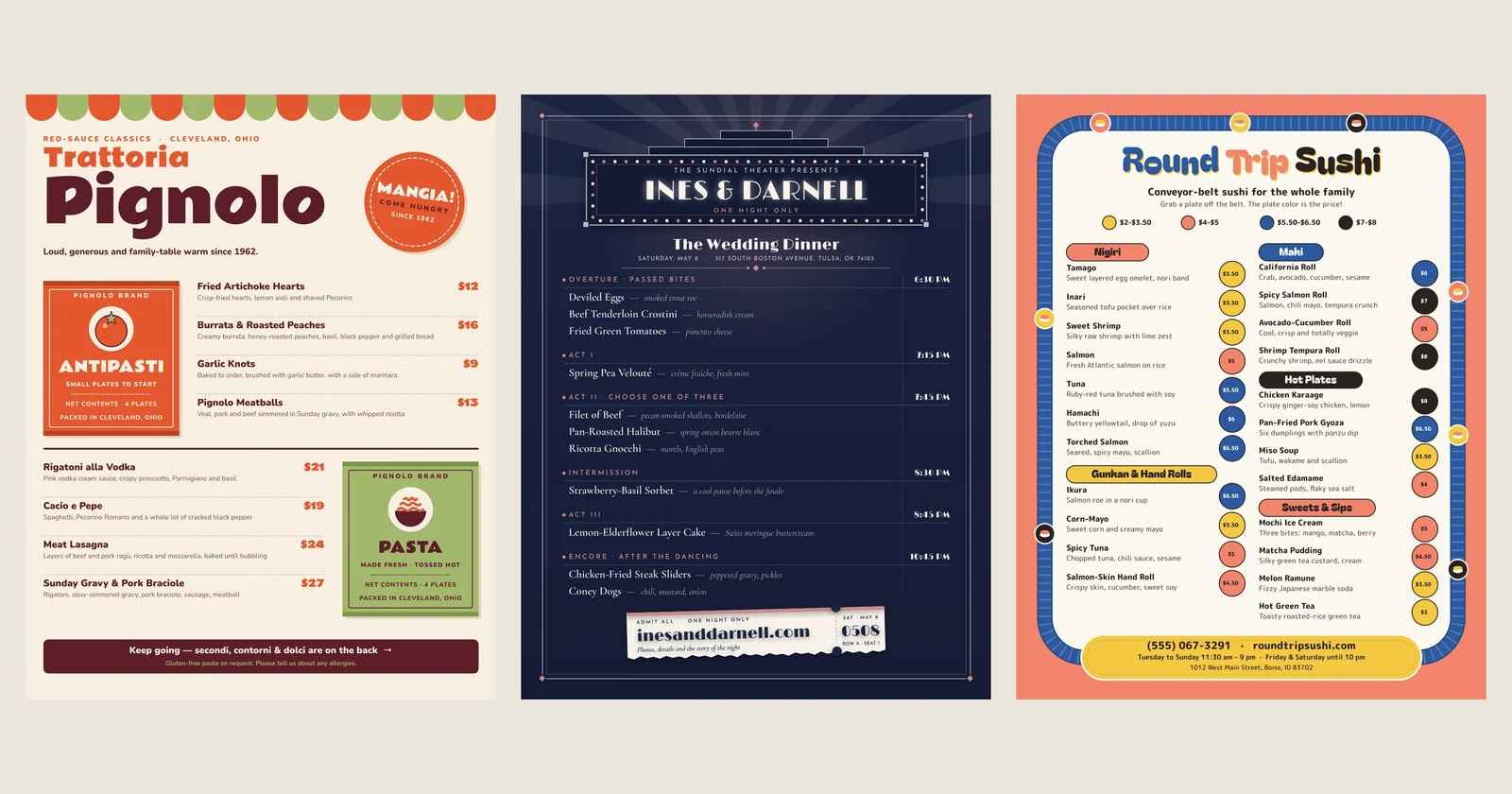
Menu designers long held that diners look first at a "sweet spot" just above the middle of the right-hand page. A 2012 eye-tracking study at San Francisco State University found otherwise: people read a menu much as they read a book, from left to right and top to bottom. It was a small study, but the lesson is easy to use. Put the courses in the order they're eaten, so nobody hunts for the mains. Pignolo puts the starters and pasta on the front, with a line at the foot that says the mains, sides and desserts are on the back.


3. A legal page for a long menu
A taquería, a diner or a café with a long menu doesn't have to go to two pages. A legal sheet is 3 inches taller than letter, enough for a sixth or seventh section. Taquería Henequén fits 20 items in six sections, from tacos to drinks, and gives each section a small tile picture so people find their place again quickly.

4. A tall card for a short list
Cocktails, desserts, wine by the glass and tasting menus rarely run past a dozen items, and a full page makes them look sparse. A 4 × 9 inch card fits in one hand, stands in a holder on the bar and slips into a check presenter. The Quarter Hour sorts its drinks by the hour you'd order them, from spritzes at 9:00 to nightcaps at 12:45, with the bar snacks in a band of their own.

5. A counter menu people read from a few steps back
At a counter, people read the menu while standing in line, often a few feet away. Big section names, fewer words and prices in bold are what work here. Searline Burgers has just four sections on solid color bands (Burgers, Not Burgers, Sides, and Shakes & Soft Serve), so you can find yours at a glance.

6. A kids' menu with something to do
A kids' menu is read by two people: the parent who orders and the child who waits. Give the child something to do. Coulee Kitchen's kids' menu asks "Can you find all 7 crawfish?" and hides them round the page, while the parent reads five short sections with small prices.

Make the right dishes stand out
7. Put one dish in a box or a circle
Most people decide quickly, and the dish you frame is the one they notice. Pick the dish you're known for, or the one with the best margin, and give it room the others don't get. Cazo de Cobre puts its carnitas by the pound in a big copper circle with two prices, and sets the rest of the menu around it.


Frame one or two dishes, not five. When everything is boxed, nothing stands out.
8. Sections in panels of their own
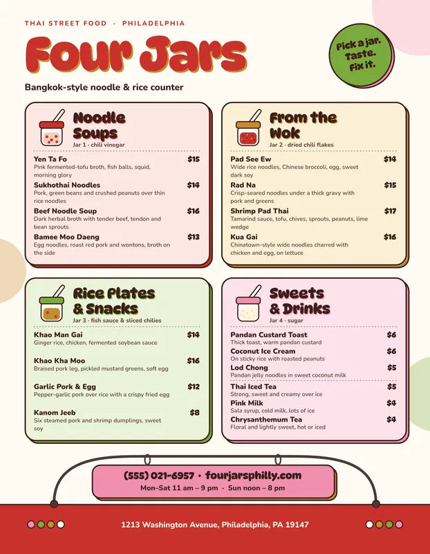
Panels turn a long list into a few short ones. Four Jars, a noodle counter, gives each section its own colored card (noodle soups, dishes from the wok, rice plates and snacks, sweets and drinks), so the eye goes to the right card first, then down it. Keep each section to about five to seven dishes; past that, split it.
9. Drawings instead of photos
A photo of every dish makes a menu look like a takeout flyer, and a bad photo sells nothing. Small drawings set the mood without promising what a plate will look like. Peeler's, a vegan café, marks each section with a drawn fruit or vegetable wearing a produce sticker.

If you do use photos, use one or two of your best dishes, taken in good light, rather than one of everything.
10. Let a color stand for a price
When many items share a few prices, say it once. Round Trip Sushi, a conveyor-belt sushi bar, puts a key at the top: a yellow plate is $2 to $3.50, a coral one $4 to $5, and so on. Each roll then sits beside a plate of its color. The menu matches what guests see on the belt.

Prices and wording
11. Prices after the description, without the dollar sign
A Cornell study at the Culinary Institute of America's restaurant found that guests given a menu with plain numbers, "20" rather than "$20", spent more than guests whose menu showed dollar signs. It was one restaurant, but dropping the "$" costs nothing.
Where the price sits matters too. A column of prices down the right edge makes it easy to scan the prices before the dishes. Putting the price at the end of the description, in the same type, has people read about the dish first. Saltmarrow, a seven-course tasting menu, lists no price per dish at all, only the extras: "+ 18" beside the scallop for caviar.

12. A drinks list of its own
Wine and cocktails change more often than food, and a separate list can be reprinted without touching the food menu. Give wines two price columns, by the glass and by the bottle, as Lindenau Hall does, and name the sections in your own voice: this Texas wine bar names its sections after dances, The Waltz for sparkling and The Polka for rosé.
13. One small key for dietary marks
Vegetarian, vegan, gluten-free, spicy: a small letter or icon after the dish name, explained once at the foot of the page, says it without cluttering every line. Use the same marks wherever they appear, and keep them small enough that they don't compete with the dish names. Chains with 20 or more locations in the US must also show calories next to each item's name or price.
Give it a look that's yours
14. Borrow something from the room
The best-looking menus look like the place they're in. Marble Top, a Toronto Irani café, takes its theme from the signs of house rules that hang in the old Irani cafés of Mumbai. It opens with "Rule 1: Sit down, read the rules, order anyway", and puts a playful rule over each section, on a black-and-white checkered border.

Look around your own place for the idea: the tiles, the old sign, the boat, the street.
15. A menu for one evening
Weddings, private dinners and holiday menus are read once, so they can tell a story. Ines & Darnell's wedding dinner is a theater program: the courses are the acts, from the overture of passed bites to an encore after the dancing, each with the time it's served.

How to make a menu in boom.design
Start from a template
Open any menu above, or browse the menu templates, including the fine dining, street food and diner menus. Press Use this template, and it opens in the boom.design editor as a project of your own. Starting from a template costs no AI credits.
A letter menu opens at 2625 × 3375 pixels: 8.5 × 11 inches at 300 dpi, plus ⅛ inch round every edge for trimming. The page's size shows in the bar above it.
Change the dishes and prices
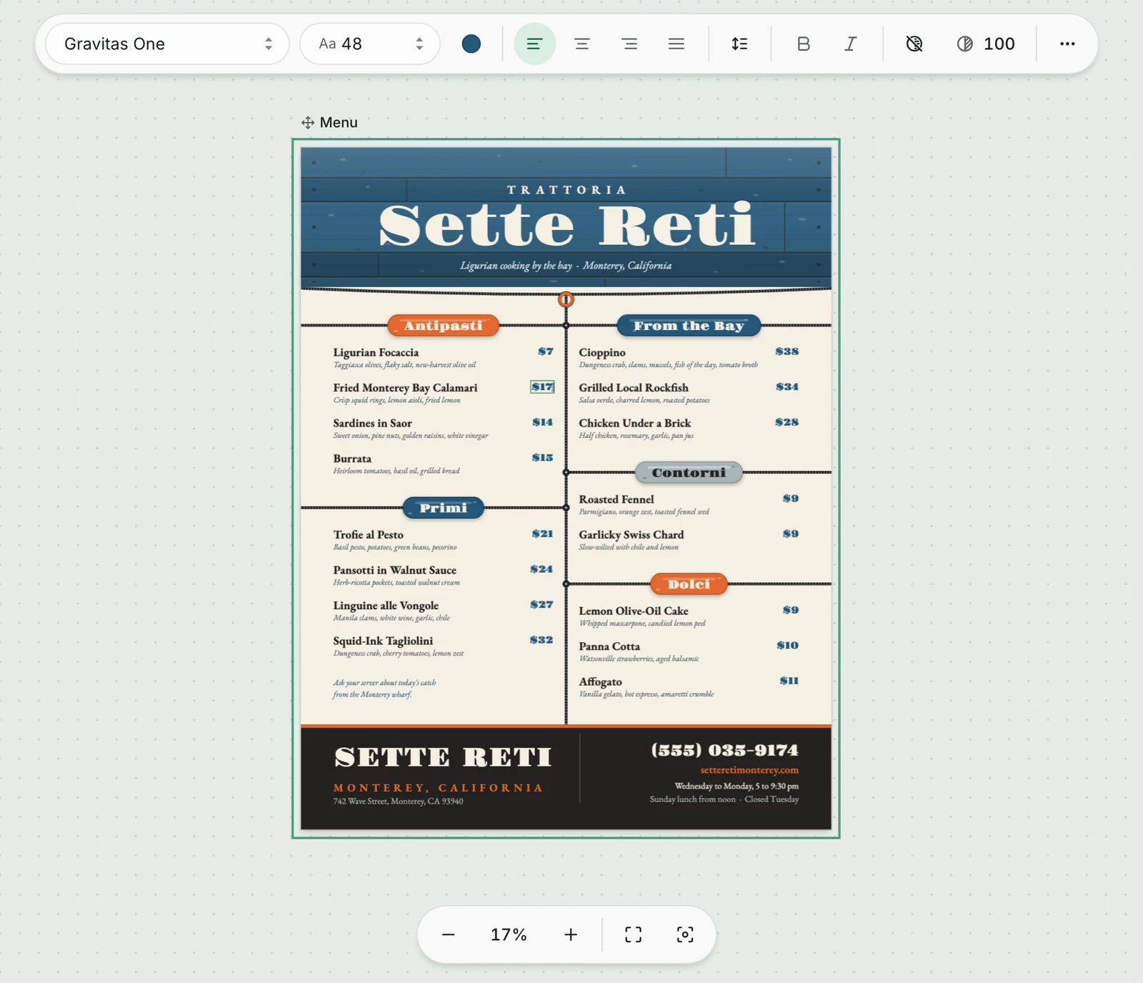
Double-click any dish or price to type over it. With a text selected, the bar above the page holds its font, size, color and alignment.
To add a second side, such as drinks, open Layers in the tool rail and use the page's … menu to Duplicate page, then change the copy.
Or describe the place
Type the menu into the boom.design home page: what the place is, the size, and the dishes and prices. The design agent asks a few questions first, such as one side or two and whether it's going to a print shop, then draws the menu as a design you can edit. You can attach a photo of a menu you like with Attach images; the agent takes its colors, type and layout as a reference. Drawings, like Peeler's fruit or a mascot, cost 10 AI credits each, and a new account comes with 50.
Put a QR code on the table
A QR code on a table tent or on the printed menu can open the same menu on a guest's phone: handy for a large-print view, a second language or this week's specials.
-
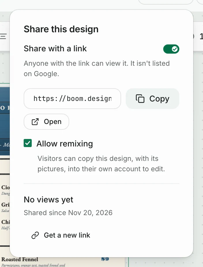
Press Share in the bar at the top and turn on Share with a link. Anyone with the link can see the menu; it isn't listed on Google.
-
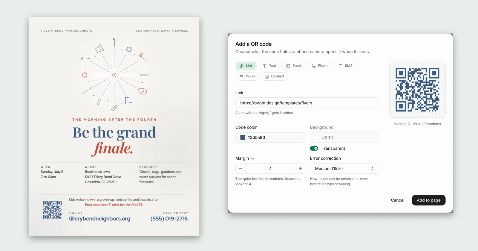
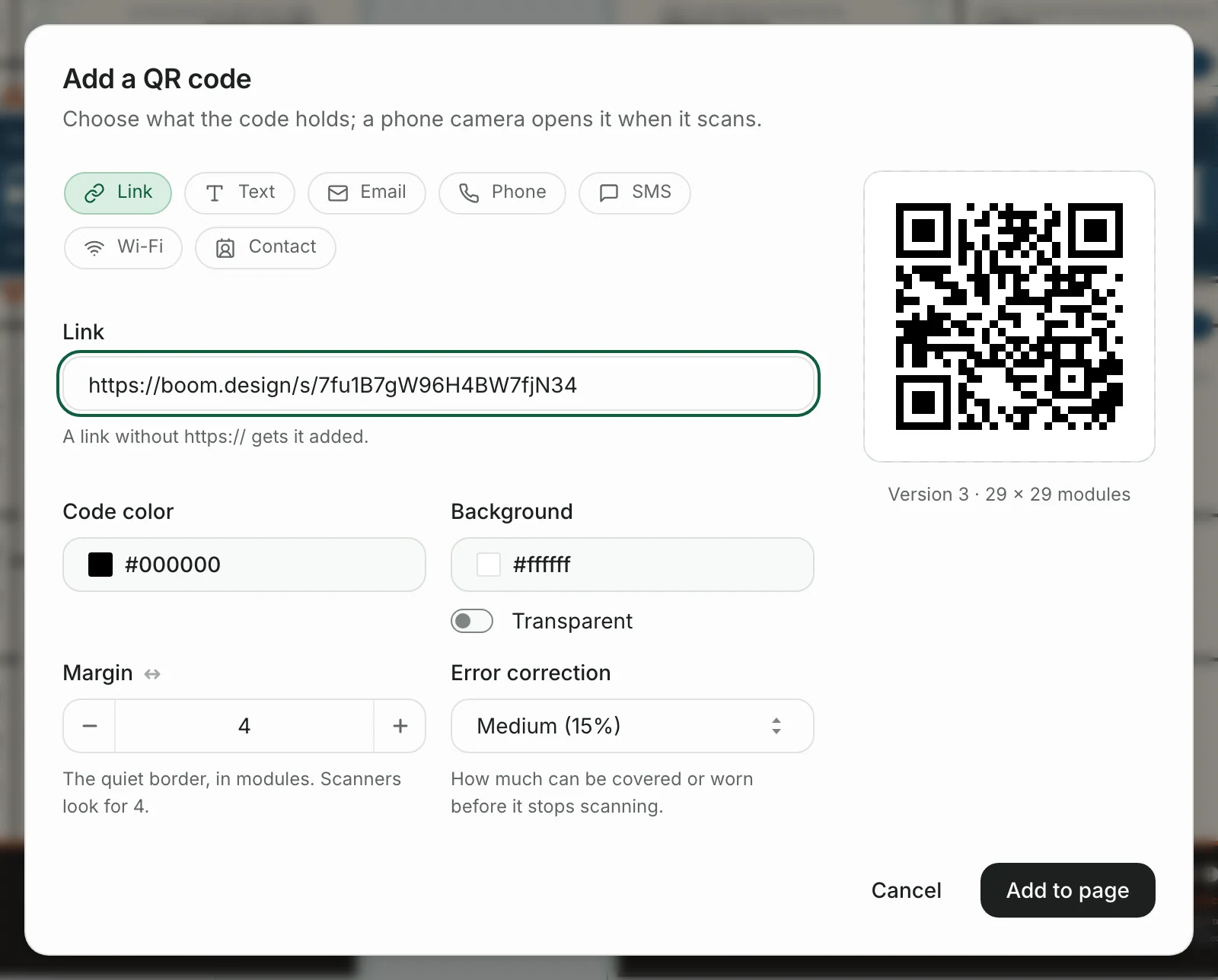
Open Extras in the tool rail and press QR code. Leave it on Link and paste the share link.
-
Press Add to page, drag a corner to size it, and drag it into place. Keep it at least 2 cm (0.8 in) wide, dark on light. Double-click it later to change the link.
On a phone, the link opens the menu a page at a time, and guests pinch to zoom in. When you change a price, the link shows the new one within about a minute, so the printed code never has to change. The guide to adding a QR code to a flyer covers sizes and testing before you print.
Download it
Press Download and choose a format. PNG and JPG come with the free plan: a letter menu comes out at 2625 × 3375 pixels, which prints sharp at full size. Paid plans, from Starter up, add PDF, the one to send to a print shop.

Menu design questions
What are the different menu styles?
By format: a single page, a folded or two-page menu, a tall card, and a board on the wall. By what's on it: à la carte, where each dish has its own price; prix fixe, a set price for set courses; and tasting menus, many small courses at one price.
How many items should a menu have?
As many as the kitchen does well, laid out so no section runs past about seven dishes. If a section grows longer, split it, or move it to its own card, as drinks and desserts often are.
What size is a restaurant menu?
In the US, most are letter (8.5 × 11 in) or legal (8.5 × 14 in), with tall cards about 4 × 9 inches for drinks and desserts. Ask your printer what they need around the edges; the boom.design templates leave ⅛ inch on every side for trimming.
More menus to start from
These are the newest of the boom.design menu templates. Each one opens in the editor, ready for your own dishes.

Elegant Engraved Citrus Vegan Café Legal Menu


Rustic Texas Wine Bar Two-Page Wine List
2 pages


Retro Diner Letter Board Wedding Dinner Menu
2 pages

Hand-Drawn Korean Dessert Café Legal Menu with Dalgona Discs

Minimal Color-Block Pizza al Taglio Legal Menu

Minimal Halo Prairie Cocktail Bar Menu

Rustic Creek Stone Fine Dining Tasting Menu Card

Cross-Stitch Sampler Pennsylvania Dutch Brunch Menu